Thursday 25 February 2010

Analysis Of Two Music Magazine Front Covers


More Detailed Analysis


Second Front Cover Analysis

Mock Up of College Magazine Front Cover + Comments


This is my first magazine I have made on the adobe Illustrator programme. The image has not been photoshoped at all, therefore the image is very plan. If I had photshoped it, I could have acheived a better look and feel to the magazine, which would then gain more recognition when on the shelves of stores.
The main focus of the image(the face) is rather dull and cannot be seen at a reasonable magazine standard. Again this could have been changed on photo shop.

Mock Up of College Magazine Contents Page + Comments


Contents page is very plain, and the choice of colours could have been a lot better. Words, and page numbers are not shaped accordingly.

Monday 22 February 2010

The Evolution of Britney Spears

You can clearly see the evolution of Britney Spears on the cover on Rolling Stone magazine. How are these images constructed to present ideas about the star? Remember, in the first cover she is only 17!
Answer the following questions about each cover making sure that you use appropriate terminology.


1) How has the image been framed/cropped?
This image has been cropped so that the main focus of the image is Britney Spears.
What type of shot has been used and why?
The view of the camera shot is called a bird’s eye view. This is camera has been raised above the focus to give the impression of vunerability
What type of magazine is this typical of (refer back to the readership statistics)
The type of magazine I believe this is a typical image of is a men’s magazine. Simply because, there are certain tactics used in this frame, to attract men to the magazine. Pervs!
2) Describe Britney’s costume. What does it suggest about her image? Who is this appealing to?
The costume Britney is wearing makes us think that she has just tripped down to bra & knickers. This tells us that she is a bad, freaky girl. This is appealing to men.
3) Have any props been used? What messages are they conveying to the audience?
The props that have been used are a phone, and a telly tubby doll. This makes us think that she is still a little girl as she is holding a doll which is related to little kids.
4) What setting is used and what are the connotations of this?
Connotations of the magazine front cover that she is a young girl with a twist.
5) What colours are used and why?
Purple, Grey and White. Purple is used because it can be referred to as a girls colour. Whit with black outlined writing because it stands out


1) How has the image been framed/cropped? What type of shot has been used and why?
The image has been framed as a medium long shot
2) Describe Britney’s costume and pose. What type of relationship does she want with the reader?
Britney’s costume is very revealing. The reader is more likely to see anyone like this if in a relationship with them. I believe this is the type of relationship she wants to have with the reader.
3) What setting is used and what are the connotations of this?
To me, the setting looks like a bedroom due to the white sheet & white background. I believe the connotation of this image is to show the reader what type of girl Britney has now transformed into from being a high school teen.
4) How is lighting used?
Lighting has been used but there is a restriction of shadows. There is a slight darkening on her back
5) What colours are used and why?
Colours that have been used are Black, Red, Blue and White. White usually symbolises angelic themes which is ironic to what she is trying to achieve on this front cover.


1) Why has this image been chosen? Is the use of black and white significant?
This close up has been chosen to show Britney’s emotions. I think that the use of black and white means that this is the truth with no strings attached.
2) How has the image been cropped?
The image has been cropped so that it is just her face showing.
3) What type of relationship does Britney want with the audience? Is this supported by the anchorage text?
I believe that the relationship that Britney spears wants with her reader, is that of her pain. This is because of the text with states that she is inside an American tragedy. The fact that they don’t only mention the word tragedy, they call it an American tragedy. This makes it seem more severe then it initially is.

Questionnaire with results (in bar chart/graph form) + comments


Analysis of two contents pages from music magazines


The magazine uses several images on the front cover and also on the contents page. These images have been constructed in a way that makes them stand out. By this I mean that, on the front page the image of the mans hand is in front of the text. This has an effect on the reader as the image will attract them. I assume that this magazine has targeted the audience who listens to Rock genre of music because they are a part of a famous rock band.

The house style colour of the magazine is black and white. This is because the image of the group on the front cover, are wearing either black or white. It also has a little bit of red as the group member at the front has got a red circle on his t-shirt. The font looks like shattered glass and is a bit distorted. However the sell lines are bold and also quite big.


The information of what is on the inside of the magazine is set out underneath each other and is separated by vibrant yellow text. There are then numbers underneath it indicating what is on each page. There are also different sections in the magainze which tells us there is a lot to expect in the magazine.

There are promotional features in the magazine which are posters.

The graphics used to draw the attention to the special features in the magazine is the big plus at the bottom of the page.

There aren’t any franchises in on the front cover or on the contents page.
It relates to the magazine cover because it is telling people where to find things in the magazine. It also doesn’t give information about something that isn’t related to the front cover.


SECOND CONTENTS PAGE ANALYSIS


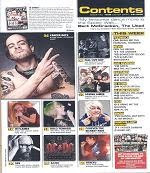
The contents page uses several images organised nicely so they fit right on top of each other. There is a picture beside most of the page numbers showing us what we will find on that page. This also helps the reader because some may like to turn straight to the page from what they have seen in the image.

One of the contents pages has a colour scheme. Black on white and a touch of yellow. The other contents page has several different colours;
Yellow, Blue, Red, Orange. The information on this magazine is organised by the coloured boxes. For every change of colour, there is a change if information, separated by sub-headings. This tells us that the magazine is organised. There is a promotional feature for this magazine. The magazine logo is placed at the top left of the page. It can be seen but will be even noticeable if the contents page’s colour weren’t too much.

For section B you should compare this magazine contents page to Clash magazines contents page. Clash magazine is a bi-monthly magazine which is aimed at 18-26 year old city slickers who enjoy live alternative music from a range of genre (e.g. rock, dance, hip-hop). How does this magazine, aimed at an older more sophisticated audience compare with Kerrang or NME?!

1. How would you describe the layout of the Clash contents page? Does it remind you of anything? What does this say about the audience? How is this different to NME/Kerrang?


Clash magazine contents page layout is very simple. It only has 1 main colour scheme which is blue and white writing. It reminds me of a brochure which are very simple however informative.
This tells me that the audience will be the older people, who just want to get straight to the point of what they want to read. It is different from Kerrang/NME magazine because it is simple. It is also different because it has a few pictures.

Analysis of two double page spreads from music magazines

The Band featured in the magazine would give us a rough idea on what the target audience would be. Through simple eye scanning, you can tell that this particular article is about rap music, indicating that the magazines target audience will be rap/hip-hop fans between the ages of 10 – ongoing.


The terms used in this magazine are definately terms that rap fans can relate to.

“Then 15 years later in the game” The term “game” is usually referred to as a rap career. This term would be understood by rap fans, and that is why it is specific to this magazine.
There is a colour scheme which is simple but effective. The colours are black, white and light pink. The pink is used when the interviewer is asking a question, and the black font colour is used ast the interviewee ‘Gary GZA/Genius’ reply.
The font which has been used is a simple readable font. It is not fancy and it is not the boring basic font.
The double page spread layout has been set out in an easy however interesting way. One page is set out with the main interview. The other page is a picture of the interviewee. This gives the reader a clear image of who is being interviewed.
I believe that the magazine is addressing the audience as part of a crowd. For this article, prior knowledge would help as they make a lot of references too previous events that have been showed in the magazine.

DOUBLE PAGE SPREAD TWO:


Straight away as I am looking at this magazine, I get the idea that this magazines target audience are people interested in rock music. Simply because of the bands style of dressing.


This magazine articles style is different from other magazines as this magazine uses terms as if it was a story.

“As the gaslight anthem’s tour van rattles through the outskirts of their hometown…” This is not the usual style of magazines.
Not a lot of colour at all is used in this particular magazine. Only colours used are Black and burgundy. The background colour is sky blue.
Again, in this article, the font isn’t over the top, it is basic.
The double page spread layout is set with the picture of the band on one side, and the text on the other.

Your magazine planning – target audience, type of magazine, price etc

1. Who is your target audience?
I would prefer my target audience to be between the age ranges of`15 – 25. I would like it to be this because it I can relate to most of the common things people between this age group can.

2. What style, genre or time of music is your magazine about or it going to appeal to a range of music tastes?
My magazine is going to be about music but also a little bit about fashion. The magazine is going to be about different types of music, however, it will talk about the similarities between English, and American music. This will be of interest to a lot of people.

3. How often will your magazine come out, weekly, fortnightly, monthly or bi-monthly?
I would like my magazine to appear on the shelves every month. I think this would be a good tactic because people will have to wait in suspense, wanting to know what is going to be in the next months edition. How ever, if it came out every week, it wouldn’t have this effect on people.

4. How much will your magazine cost? Consider who your target audience is and also how often your magazine comes out?
My magazine will cost £2.50.

5. Is your magazine going to be glossy like Q magazine or more like a newspaper like NME?
I would like my magazine to be like Q magazine. The glossy look. Reason being is I believe this look appeals to the younger audience. The newspaper look wouldn’t.

My own magazine covers, contents pages, double page spread.

Front Cover


Contents Page


Double Page Spread

Basic Knowledge Of a Magazine

1. What is the Editor's main concern?
*-* The editors main concern is what is on the front cover of the magazine as this appeals and attracts the readers attention

2. Why is the front cover so important?
*-* The front cover is so important because this is what attracts the reader. A typical example is - if your favourite celebrity is on the front page of the magazine then your more likely than not to pick it up and by it. The a standard style of a front cover is good since it will enable the reader to pick out the magazine just by looking.

3. How does the editor make sure the 'Kerrang!' cover appeals to the whole of its readership?
*-* The editors make the cover appeal to the whole of its readership because they use different sub genres on the cover that gives an insight to what they would find in the magazine. These sub genres range from anything between different styles of music or celebrity stories or common topics rather than the rock music which is actually the main cause of the mag. Therefore making the magazine appeal to wider audiences.

4. What are, typically, 'main sells' (selling points) on a Kerrang! cover?
*-* Main selling points are, posters, stickers, CD's etc. Free accessories that you get when you buy the magazine.

5. How can a cover-mounted CD affect sales?
*-* By putting CD on the front cover boosts sell because CD's are not normal what you get for free with a magazine and people will take advantage of the fact they are going as a freebies and several people will buy the magazine. It could also have some exclusive stuff on it that only that one issue would release.

6. What other ways does Kerrang! use to draw in and keep its readers?
*-* They do this by putting different artists from several different genres of music on the cover for every new single issue

7. What typically features on the cover of mixmag and why?
*-* Upcoming events such as tours, parties in party islands etc.


8. What are the disadvantages of a cover mounted CD on every issue?
*-* A disadvantage could be the increase in cost; some magazines will make prices more expensive. It would be more time consuming to produce.

9. What are the two most important areas on a magazine front cover, and why is each one important?
*-* The Sweet Spot, This is the most common area a customer tends to look for when purchasing the magazine and also the logo, for identification purposes.

10. What are the two things most magazines try to do on their front cover?
*-* To try and do something different with there magazine to make it more appealing and sellable. Also to reassure there readers from one issue to the next the magazine will always try to bring them what they want but bigger and better.