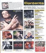
The magazine uses several images on the front cover and also on the contents page. These images have been constructed in a way that makes them stand out. By this I mean that, on the front page the image of the mans hand is in front of the text. This has an effect on the reader as the image will attract them. I assume that this magazine has targeted the audience who listens to Rock genre of music because they are a part of a famous rock band.
The house style colour of the magazine is black and white. This is because the image of the group on the front cover, are wearing either black or white. It also has a little bit of red as the group member at the front has got a red circle on his t-shirt. The font looks like shattered glass and is a bit distorted. However the sell lines are bold and also quite big.
The information of what is on the inside of the magazine is set out underneath each other and is separated by vibrant yellow text. There are then numbers underneath it indicating what is on each page. There are also different sections in the magainze which tells us there is a lot to expect in the magazine.
There are promotional features in the magazine which are posters.
The graphics used to draw the attention to the special features in the magazine is the big plus at the bottom of the page.
There aren’t any franchises in on the front cover or on the contents page.
It relates to the magazine cover because it is telling people where to find things in the magazine. It also doesn’t give information about something that isn’t related to the front cover.

SECOND CONTENTS PAGE ANALYSIS

The contents page uses several images organised nicely so they fit right on top of each other. There is a picture beside most of the page numbers showing us what we will find on that page. This also helps the reader because some may like to turn straight to the page from what they have seen in the image.
One of the contents pages has a colour scheme. Black on white and a touch of yellow. The other contents page has several different colours;
Yellow, Blue, Red, Orange. The information on this magazine is organised by the coloured boxes. For every change of colour, there is a change if information, separated by sub-headings. This tells us that the magazine is organised. There is a promotional feature for this magazine. The magazine logo is placed at the top left of the page. It can be seen but will be even noticeable if the contents page’s colour weren’t too much.
For section B you should compare this magazine contents page to Clash magazines contents page. Clash magazine is a bi-monthly magazine which is aimed at 18-26 year old city slickers who enjoy live alternative music from a range of genre (e.g. rock, dance, hip-hop). How does this magazine, aimed at an older more sophisticated audience compare with Kerrang or NME?!
1. How would you describe the layout of the Clash contents page? Does it remind you of anything? What does this say about the audience? How is this different to NME/Kerrang?
Clash magazine contents page layout is very simple. It only has 1 main colour scheme which is blue and white writing. It reminds me of a brochure which are very simple however informative.
This tells me that the audience will be the older people, who just want to get straight to the point of what they want to read. It is different from Kerrang/NME magazine because it is simple. It is also different because it has a few pictures.

No comments:
Post a Comment